Greetings!
I wanted to let you all know about a Mixed Media Weekend that I will be teaching at. Have you heard of Cozy Crop House in Lititz Pennsylvania? It's an adorable retreat house set up for crafting in an amazing space complete with yummy meals and cozy sleeping accommodations.
The weekend of February 14-16, 2014 they will hold a
jam packed Mixed Media Weekend.
We'll jump right in on Friday with a little ATC project just to warm up, then after dinner will be the first workshop! Saturday there will be three workshops and one on Sunday. If you are able to stay a little later on Sunday a bonus workshop is being planned. I told you it was jam packed, right? You will learn a lot of techniques and go home with finished projects.
The first workshop I'll be teaching will be an altered book:
DESCRIPTION: In this workshop we’ll deconstruct a vintage
hard cover book then decorate the cover with paint, gesso, and ink using masks,
stencils, stamps, and household items. We will then re-constructing the book placing
sleeves in it that hold #8 sized tags. (bonus - you get to keep the vintage
book paper!) Now you will have a place to store the technique tags you create
when taking online courses!
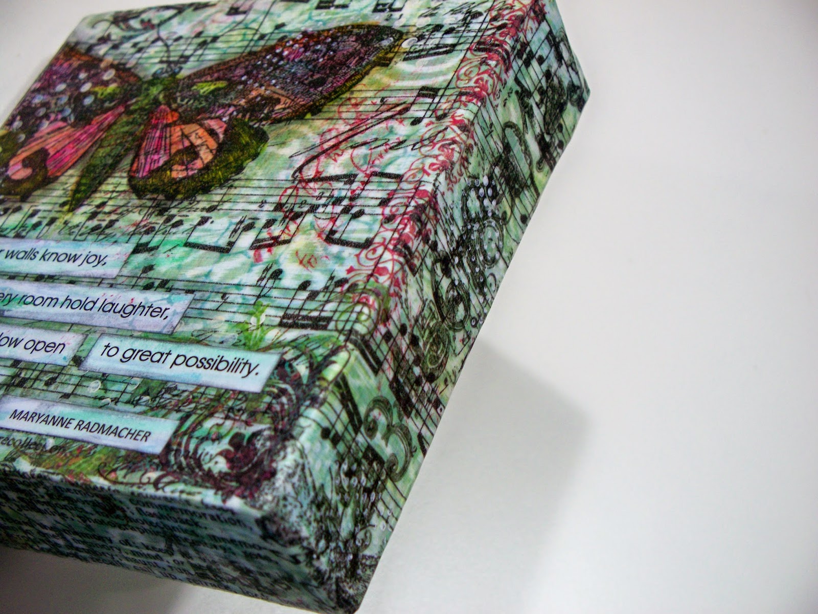
The second workshop I'll be teaching will be a collaged canvas:
DESCRIPTION: Let’s make a beautiful 8x10 canvas to keep for yourself or give as
a one of a kind gift! Create the background using ephemera, patterned paper,
paint, and ink. Learn to create layers with stamps, texture mediums, stencils
and rub-ons. We’ll add a girl and a phrase to make your canvas unique.
Kate Rothacker will be teaching a Mixed Media and Metal Elements workshop.
Tami Howse will hold a Gelli Plate workshop:
DESCRIPTION: Have fun learning how to use a Gelli Plate,
which is all the rage in mixed media and paper crafting. Make your own
one-of-a-kind monoprints with custom colors using acrylic paints, stencils,
masks, and a variety of other texture tools. We will learn a variety of
techniques with the plate and use them to make altered tags. You will go home
with a 6x6 Gelli Plate, several prints, and a stencil.
Tami will also be teaching a Canvas Banner workshop. Here is a link to Tami's blog where you can check out her amazing work.
Sounds like fun, huh?
If you'd like to join us, please email Kate at
cozycrophouse@gmail.com
for more information.
Contact her soon as we are keeping it "cozy" at just ten students
and the weekend is filling up fast!
Hope to create with you there!